Title Card: "FLIES FLIES FLIES"
This project started as a series of scripts for an animated TV show, and every draft has contained some variation on this:
I always envisioned that each episode would start with a cold open, followed by a sharp transition to a black screen and the title of the series in white. My first rendition of the title card was made in GNU Image Manipulation Program just by typing the text big and not being too picky with the font...

I thought this looked too formal, and I knew I might want to use title cards with various different text, or translate the title card to other languages, so I ended up writing a function to generate title cards with subtitles in HaxeFlixel:
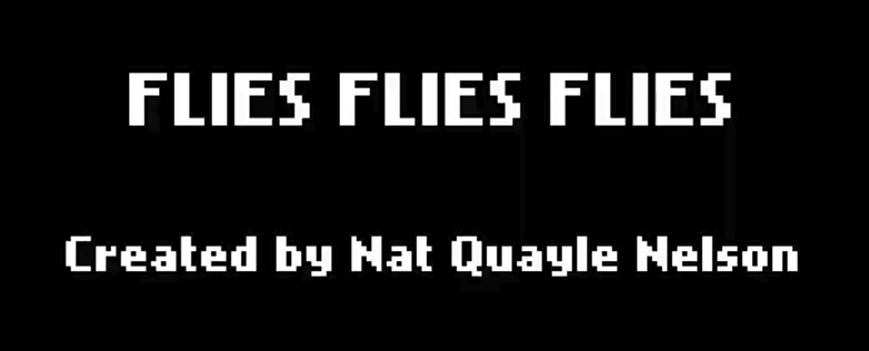
That's the one you see in the trailer and pilot. I'm a bit ambivalent about HaxeFlixel's default pixel font but I didn't have a ton of time to look for alternatives.
After releasing the Patreon pilot and deciding to make the rest of the episodes/revamp episode 1, I wanted to make a title card with more theming to it. I thought about making it "FLiES FLiES FLiES with a little fly for the dots on the eyes. So I found a free line drawing of a housefly and started to play with it, again in GNU IMP.
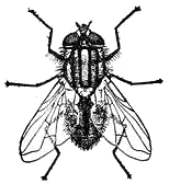
The results were not great and I didn't save any screenshots. I noticed that the fly has 3 legs on each side and wondered if I could do a capital E where the left half is normal and the right side is a fly (symbolizing a transformation/hybrid thing) but again I couldn't get it to look right.
A couple days ago I was writing my morning pages on my ReMarkable tablet and I had a spur of the moment idea that it might look good handwritten, with the simplest doodle of a fruit fly on the i dots. So I traced that out and emailed myself the PDF so I could invert the colors and see if it works.
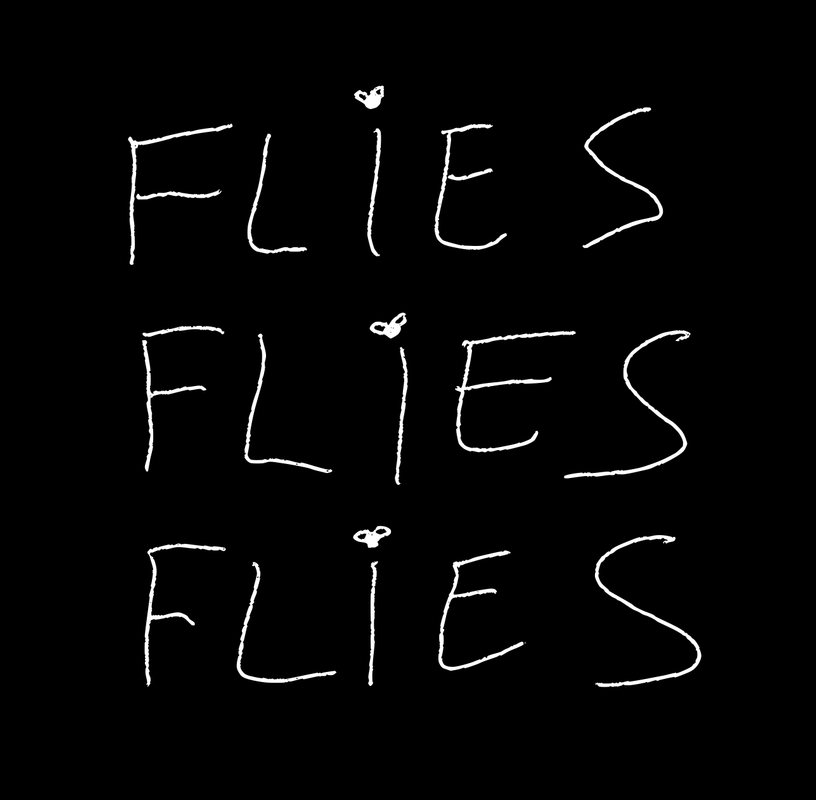
Then I proceeded to overanalyze my letter-work and kerning, and the thickness of the strokes and so I went a little crazy trying over and over to get it perfect:
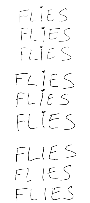
The word "FLIES" lost all meaning, and whenever I tried again I would look at the letters and they would cease to be writing and start to be random lines and archaic symbols. I got a little scared. The whole point of doing it handwritten was to give off a "idgaf" casual kind of vibe, so I decided to give it a rest. I think I like it, though? So I want to use some variation of this--The only problem is if I use this, it might make the pixel font of the subtitles clash, and I also may end up having to handwrite every other title card in the future, which isn't easily localizable and is also literally a manual process (I hate manual processes and I've gone to absurd lengths to cut them out of every other aspect of the dev pipeline for this). Maybe I could use one of those fancy shmancy AIs that turns handwriting samples into a font.
Leave a comment
Log in with itch.io to leave a comment.